Case
Rethinking a time table
Balancing accessibility, information hierarchy, and conversion for millions of daily searches.
The Accessibility Challenge
SJ's existing timetable worked for some users, but failed millions of others. The design system's new beautiful cards hid crucial pricing information, while the old table-based layout couldn't scale text without losing all hierarchy.
When 40% of your users have enlarged text settings, and screen readers can't parse your content logically, you have a problem that goes beyond aesthetics.
The challenge:
• 40% of users with enlarged text settings
• Ok screen reader experience but some illogical reading order
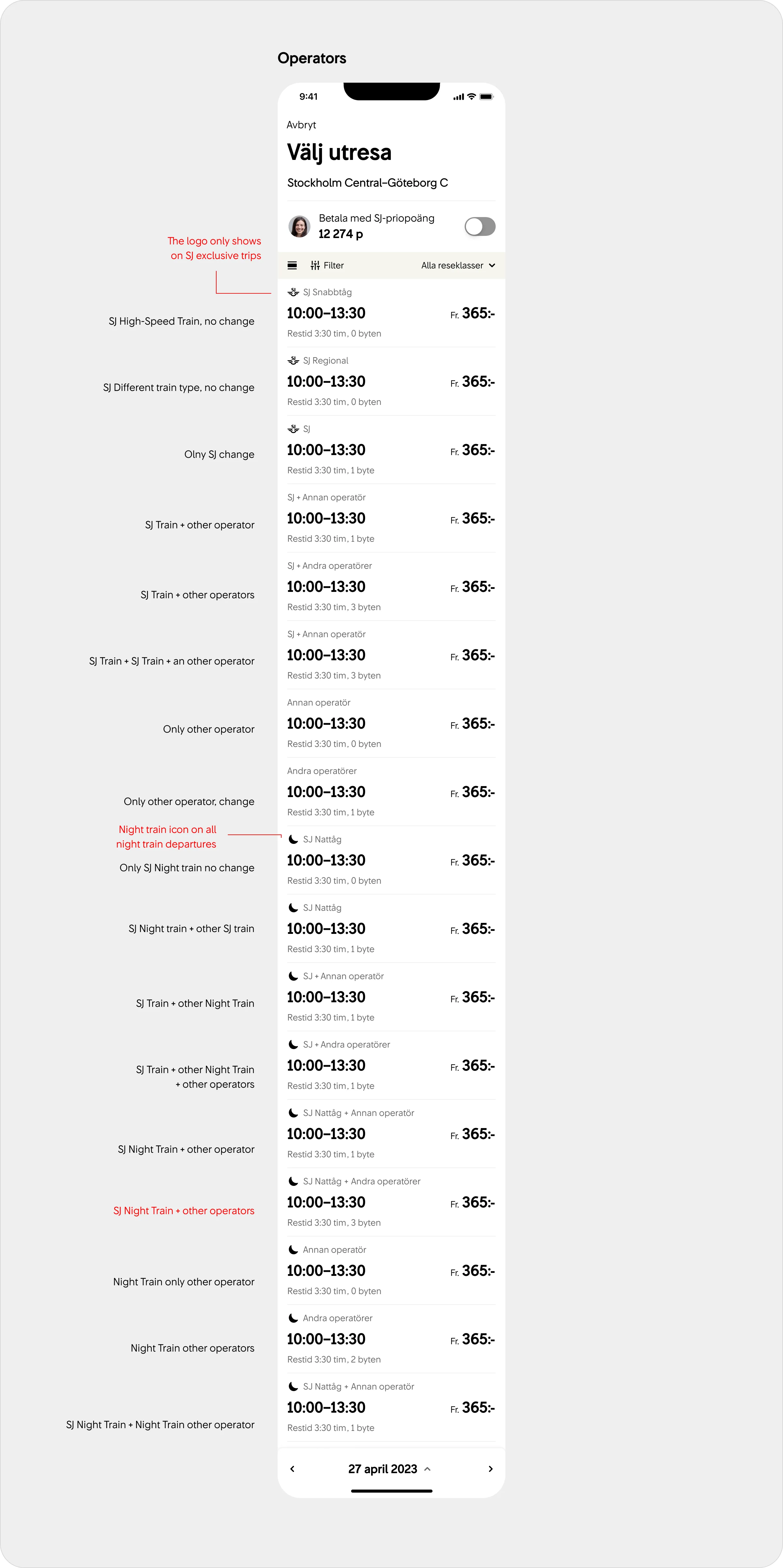
• Pricing information buried behind extra clicks
• Cards too tall for mobile - only 1.5 departures visible
• Impossible to add new travel classes to existing structure

Research & Discovery
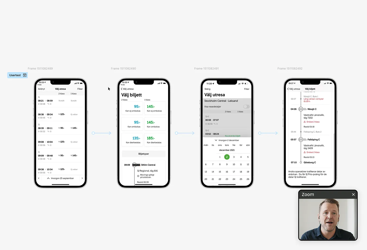
We ran 2-3 user tests to understand both the existing experience and design system variants. Combined with web analytics from their earlier release, we saw clear patterns: users needed pricing transparency and better overview without sacrificing accessibility.
We partnered with an external accessibility agency for a thorough audit, identifying specific barriers in both design and function. The biggest insight: beautiful doesn't mean usable if people can't actually use it.

Two Views, One Experience
Instead of forcing one solution, we created two complementary views:
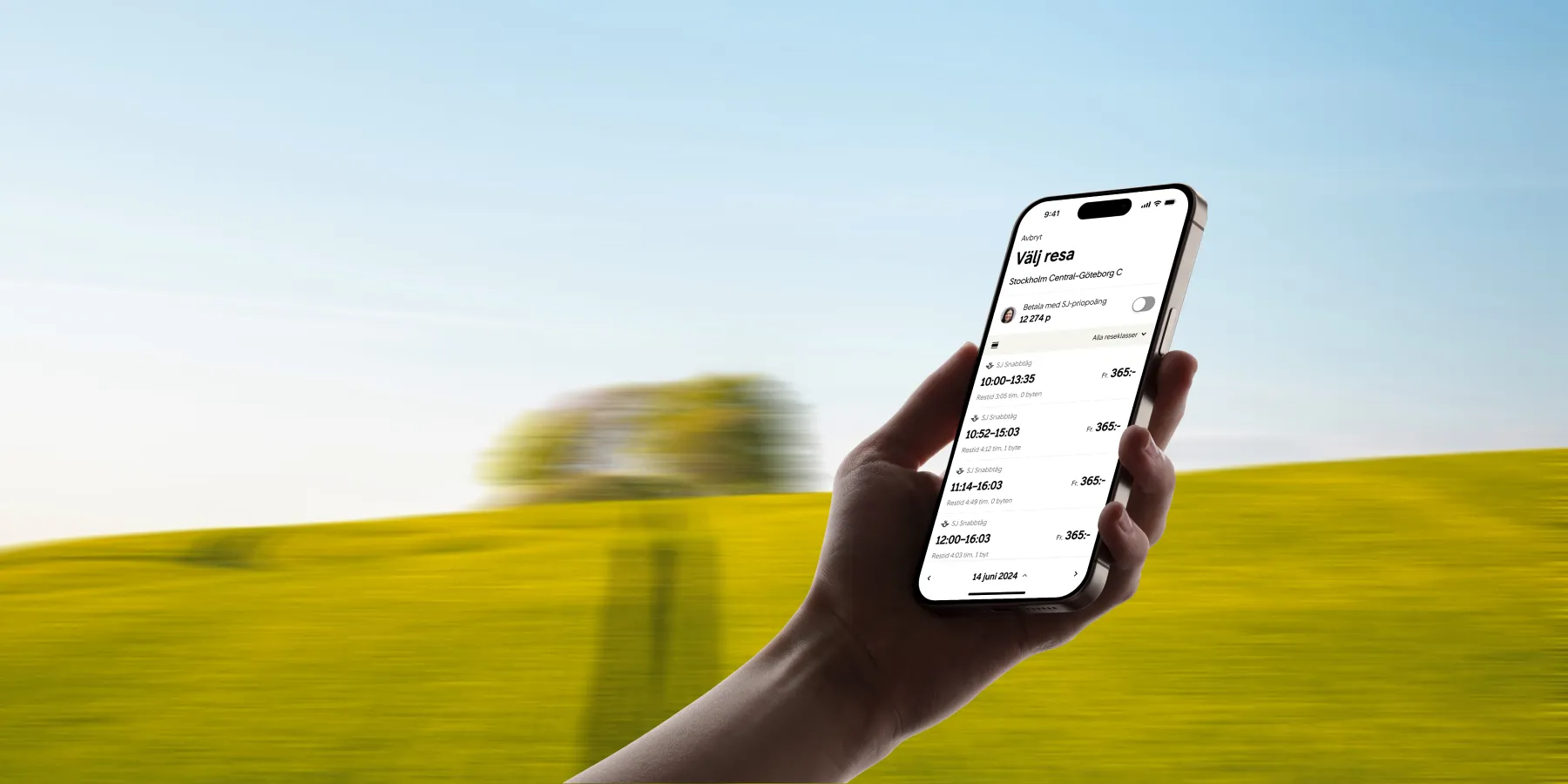
Card view
Rich information with train illustrations for each departure type, perfect when you need detail and context.
List view
Minimal height per departure, maximum overview, scales perfectly to 2x text size while maintaining clear hierarchy.
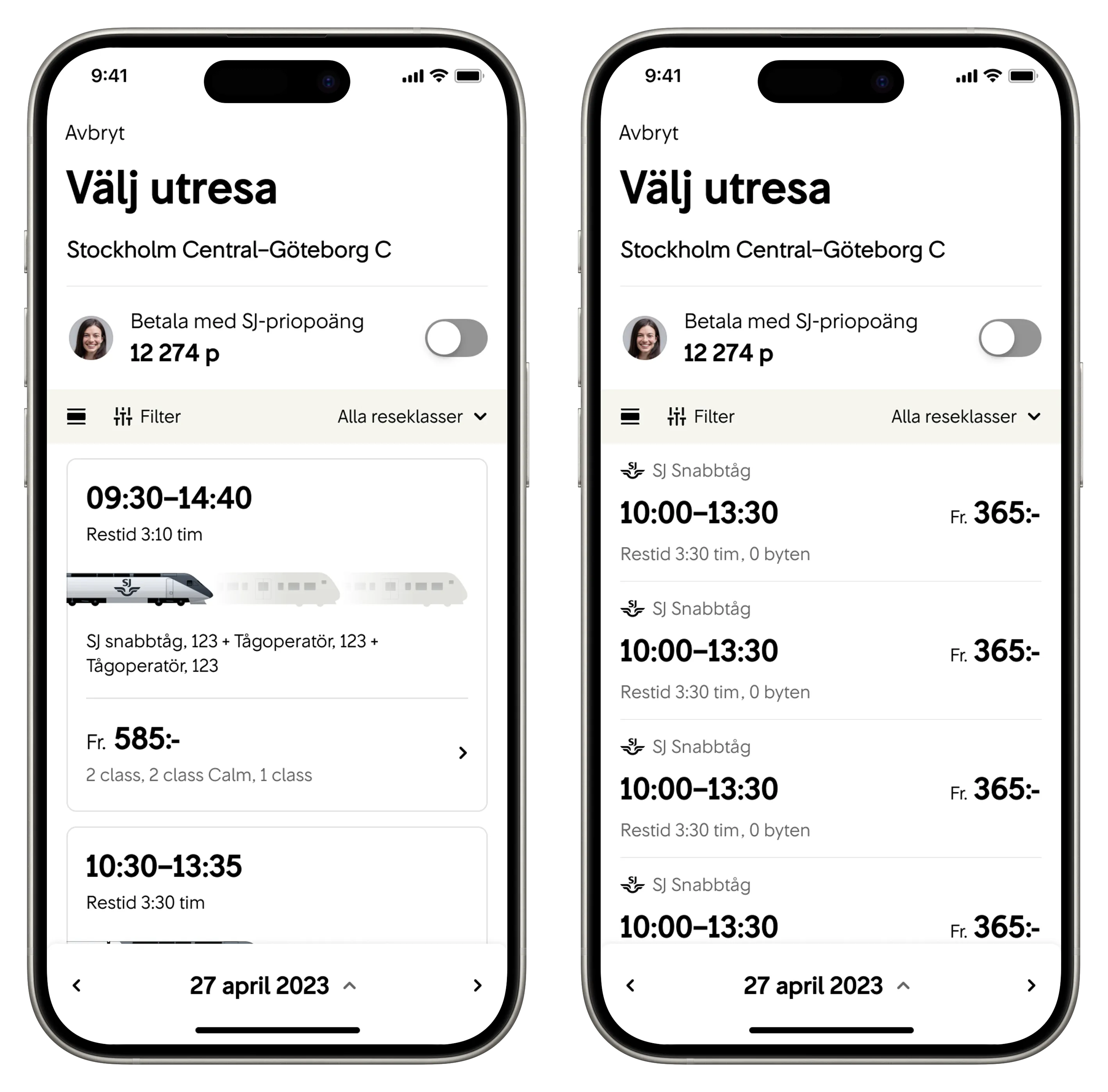
Smart pricing menu
Choose your preferred class and see those prices across all departures - no more clicking through to compare first-class fares.
Accessibility-first Design Decisions
Text scaling:
Works perfectly at 2x size without losing information hierarchy
Screen reader flow:
Logical, chronological reading order for all departures
Visual support:
Icons paired with text, never standing alone (except universally understood train features)
High contrast:
Built into every color decision
Traffic information:
Integrated directly into cards/list for immediate context
Darkmode support


Testing & Iteration
We user-tested our redesigned timetable 3 times, refining copy and information hierarchy based on real user behavior. The external accessibility audit helped us catch edge cases we'd missed.
Launch strategy:
We defaulted to card view initially, but quickly noticed users preferred the list view for its superior overview. We switched list to default with smooth transitions to cards when users needed more detail.
Results & Impact
• 40% of users with enlarged text now get the same experience as everyone else
• Screen readers can navigate chronologically without confusion
• Pricing transparency improved without sacrificing overview
• Successfully accommodated new travel classes (2nd Class Quiet)
• User feedback praised simplicity and scannable information
Trade-off honesty:
Some users miss seeing all prices at once, but the majority appreciate the cleaner, more accessible experience.
What I Learned
This project taught me that inclusive design isn't about adding accessibility features later - it's about making accessibility the foundation of every design decision. When you design for the most constrained users first, you create better experiences for everyone.