SJ - Case
system change chaos
How we guided 2+ million travelers through a booking system migration without losing their trust. When SJ needed to run two booking systems simultaneously, clear UX design became the difference between chaos and calm.
The Crisis
SJ was replacing their entire booking backbone while keeping millions of monthly bookings flowing. For months, we'd run two systems in parallel - old trips in the legacy system, new trips in the updated one. Users booking travel could land in either system depending on their dates, and we needed to make this technical nightmare feel intentional and clear.
The stakes were high
Any confusion could mean lost revenue, frustrated travelers, and overwhelmed customer service. SJ wanted the simplest possible solution - no expensive technical bridges, just smart UX and clear communication.
The challenge in numbers:
• Millions of monthly users across app and web
• Two parallel booking systems with different capabilities
• Edge cases everywhere: rebooking across systems, return trips spanning both
• Zero budget for complex technical solutions

The Breakthrough
Working with a skilled iOS developer who understood the technical constraints, I developed an approach that could work for both app and web. The key insight: stop trying to hide the complexity and instead guide users through it clearly.
Move the calendar first
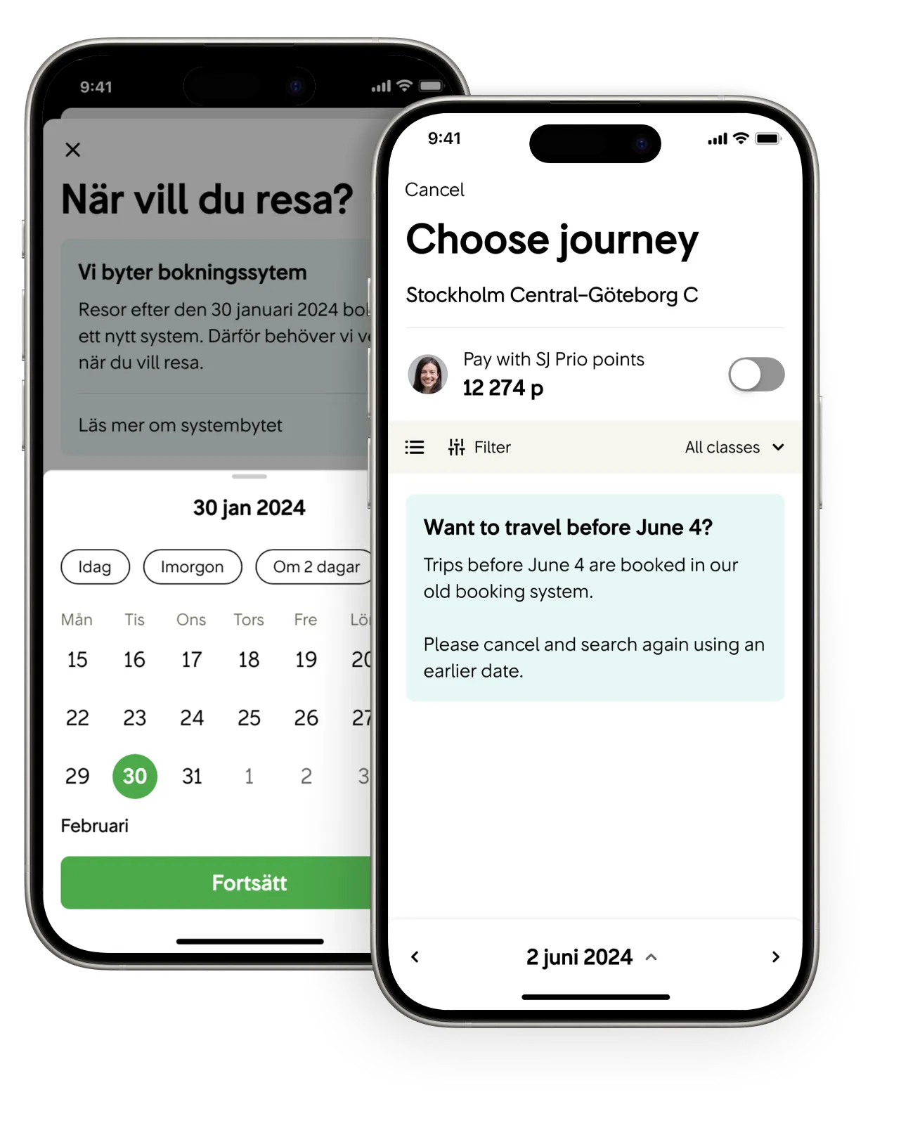
Instead of routing users invisibly, we moved date selection to the very beginning with an upfront message about the system transition. This let us direct users to the right booking flow immediately based on their travel dates.
Design honest empty states
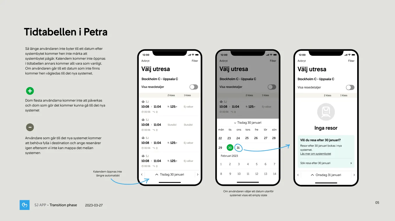
When users navigated to unsupported dates, we created empty states that clearly explained how to find trips - guiding them back to adjust their search rather than hitting confusing dead ends.

The Hardest Part:
Edge Cases
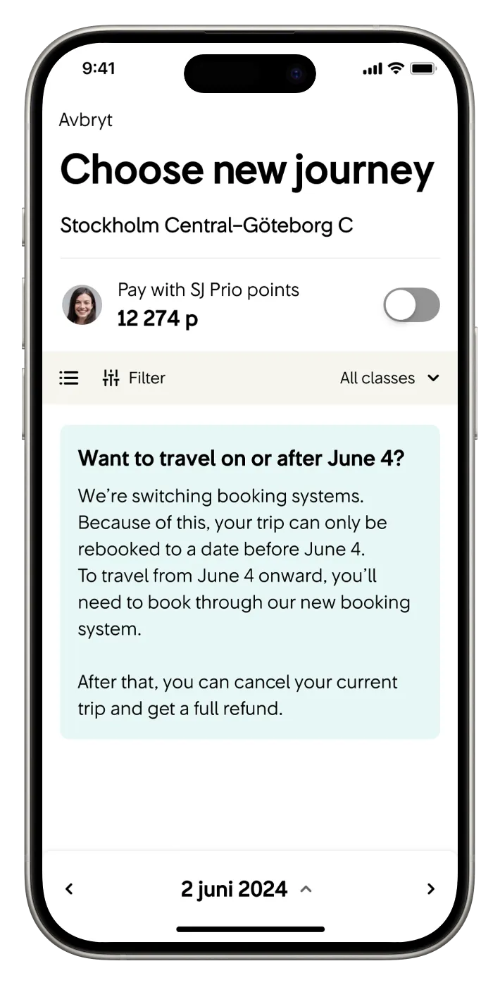
The real challenge was handling the impossible scenarios: rebooking old tickets for new system dates, return trips that spanned both systems. We had to be brutally honest - users would need to cancel and rebook separately.
Getting the copy right
We ran 4 user tests focused purely on these edge case messages. Our first version had an 'info' button explaining the system change, but users clicked it expecting to move forward and hit a dead end. We removed it and refined the copy until users intuitively understood they needed to go back and recalibrate.


Leading the Solution
I took the lead in presenting our approach to SJ's web team and stakeholders, who adopted our strategy across platforms. This wasn't just a design challenge - it required convincing stakeholders that our UX-focused solutions would maintain users trust in the service during this period.
The politics were intense, but we proved that clear communication and smart routing could solve what seemed like an impossible technical problem.

Results & Victory
• 2+ million users successfully navigated the transition – Most of them never even saw it
• No chaos at customer service, not even during the critical final week
• Smooth migration with minimal user confusion
• Web team adopted our approach
• Proved UX strategy could solve complex technical challenges
An incredible victory - we turned what could have been a customer service nightmare into a smooth, barely-noticed transition.
What I Learned
This project taught me that sometimes the best design solution isn't hiding complexity - it's being honest about it while making users feel guided and safe. Leading cross-platform UX strategy showed me how mobile-first thinking can drive solutions across entire ecosystems.


